

Shape
Add shapes to your videos for visual structure, emphasis, and design.
Add shapes to your scene—they're incredibly versatile! Use them as containers for images and text, create eye-catching overlays, design interactive buttons, add arrows and labels, and much more.
Add a shape
- Select the
Shapebutton in the top toolbar. - Select a shape from the available options.
- Drag and position the shape in your scene, then adjust its size, rotation, color, border, and shadow settings as desired.
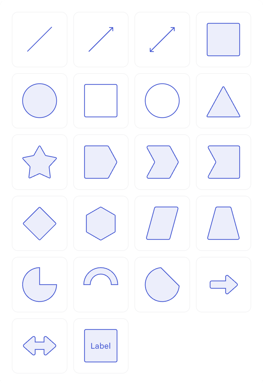
Available shapes:
| Column 1 | Column 2 | Column 3 | Column 4 |
|---|---|---|---|
| line | single line arrow | double line arrow | solid square |
| solid circle | empty square | empty circle | solid triangle |
| star | process start | process middle | process end |
| diamond | hexagon | parallelogram | trapezoid |
| pie | block arc | chord | block arrow |
| double block arrow | square with label |
Shape settings
Select a shape and head to the inspector panel to adjust its settings. Double-clicking on a shape to add text also reveals text style settings.
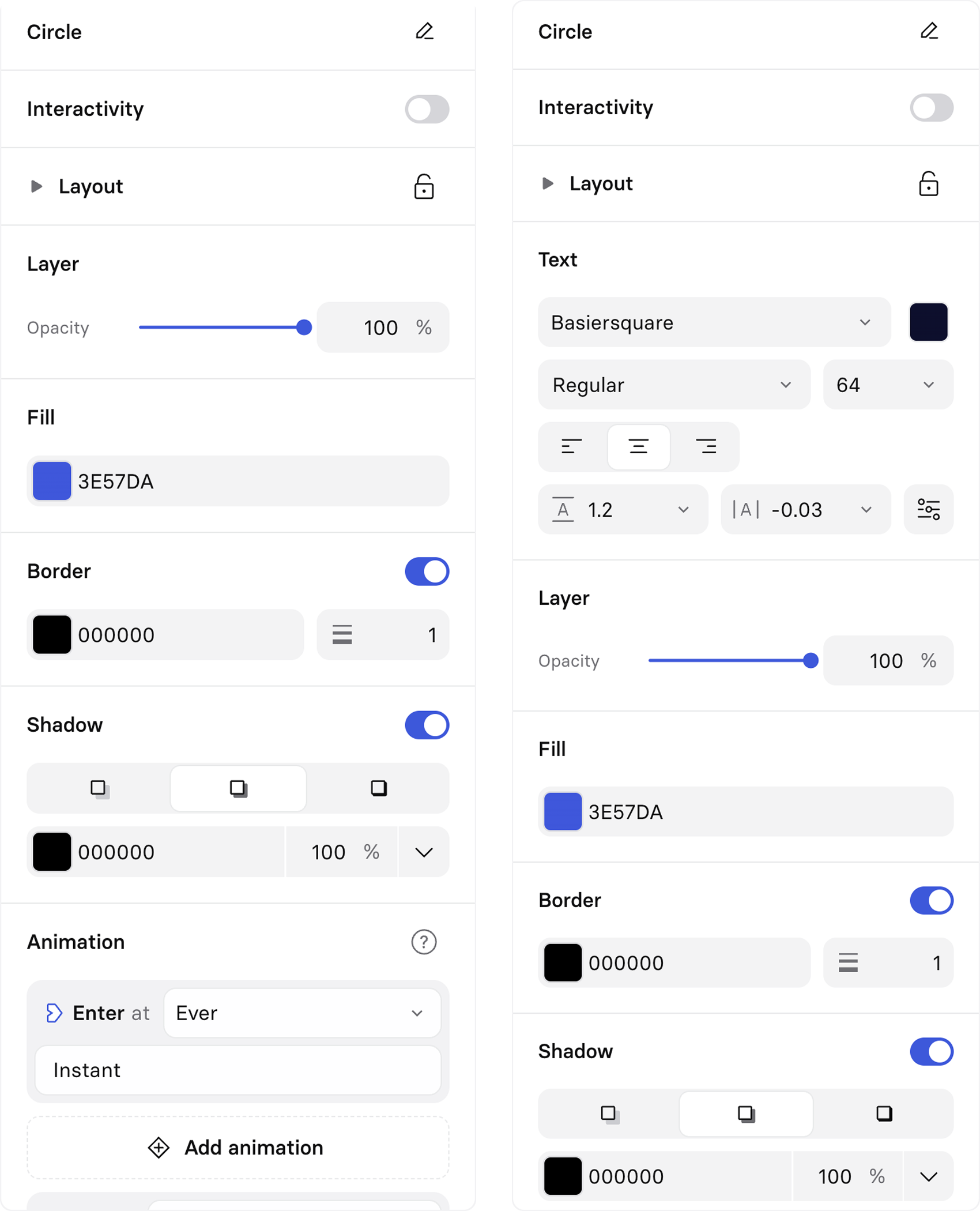
Interactivity
Toggle on interactivity to turn your shape into a button. Double-click on your shape to add button text.
Layout
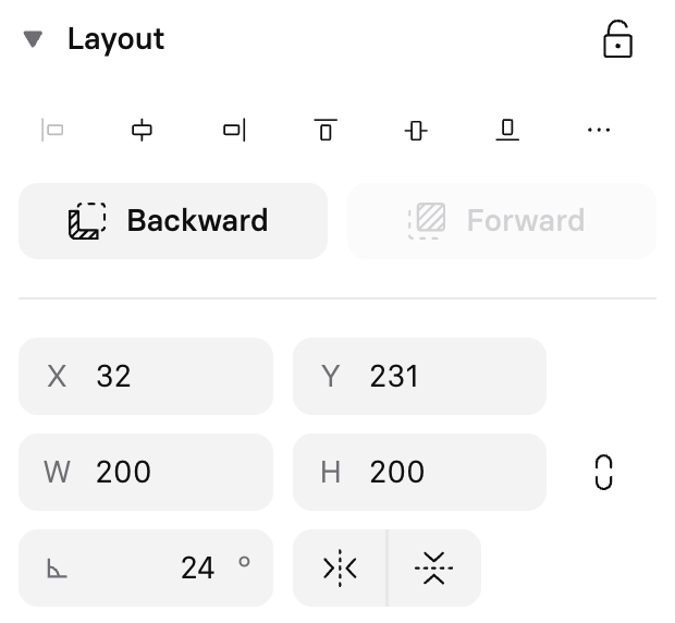
Use the layout settings to:
- Lock the layer to prevent accidentally moving it.
- Adjust the element's alignment and distribution to the canvas and to other elements.
- Move it forward or backward in the layer order.
- Manually adjust or set its X and Y coordinates on the canvas.
- Manually adjust or set its height and width, with the option to constrain its proportions.
- Manually adjust or set its angle/rotation.
- Flip it over a vertical or horizontal axis.
Text
Text settings appear if you double-click on a shape and add text to it.
Layer
Opacity
Adjust the transparency of the entire shape layer. Alternatively, adjust the opacity for either the fill color or the border, so you could have a semi-transparent fill color with a fully opaque border, or the inverse. Layer opacity affects the entire layer instead.
Radius
Adjust the border radius (corner roundness) for a shape.
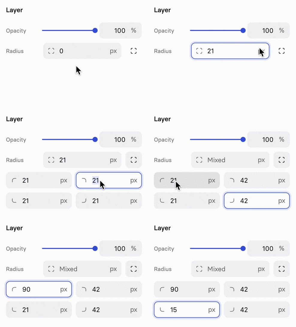
For rectangular shapes (squares, rectangles, images, videos, and SVG icons), you can control each corner independently:
- Select a rectangular shape.
- In the
Radiussection, select the corner icon on the right to set the radius for each corner independently. - Adjust each corner separately: top-left, top-right, bottom-right, and bottom-left.
This gives you precise control for custom designs, such as buttons with rounded top corners or speech bubble shapes.
Fill
Change the shape fill color—it can be a solid color or a gradient.
Note:Gradients are only available as a color option for fill and text color, not for borders or shadows.
Color picker
Change a color or apply a gradient using the color picker:
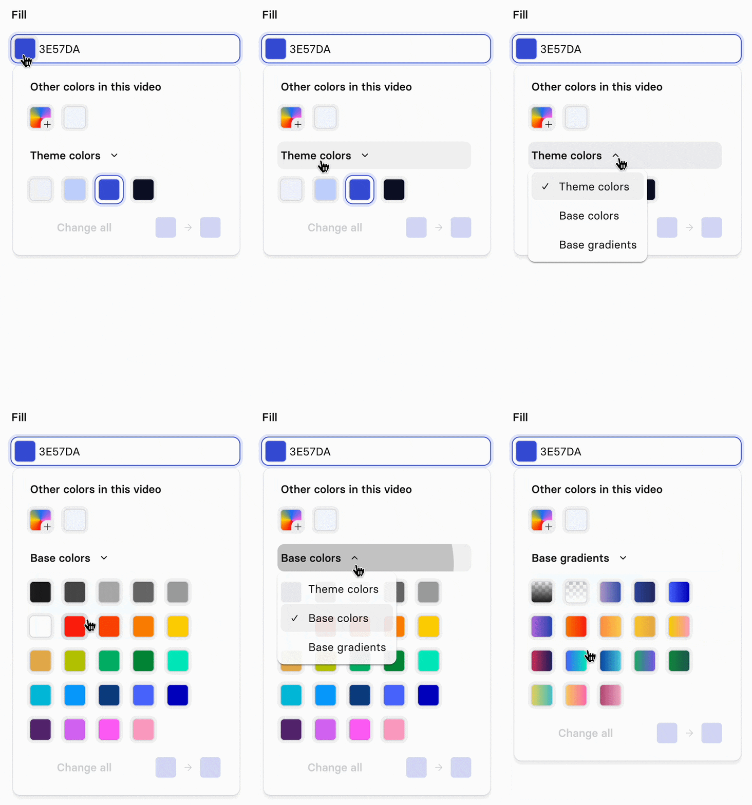
- Other colors in this video: Select from colors already used in this video.
- Custom colors and gradients: Select the rainbow square with the plus icon to create your own.
- Theme colors: Use colors from your Brand kit (Enterprise only).
- Base colors: Choose from a default palette.
- Base gradients: Select from pre-built gradient options.
When adding a new color, or after selecting an existing one, choose between HSL or Hex input and set the color's opacity:
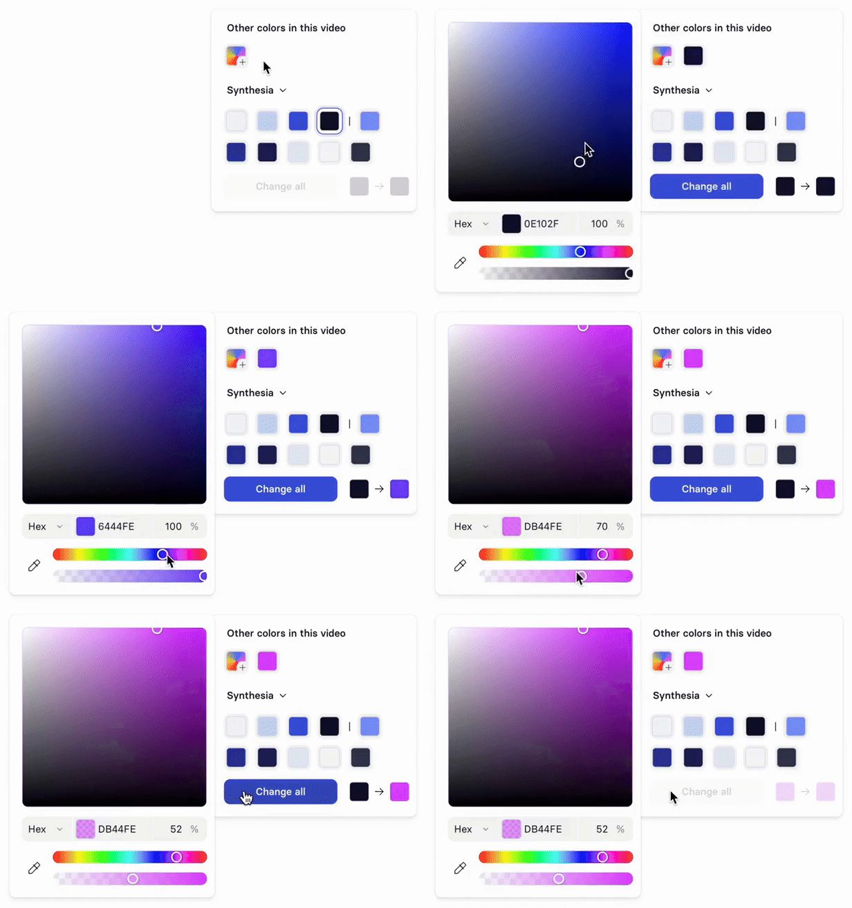
After selecting a color, select
Change allto replace every instance of that color throughout your entire video.
Gradients
Select the rainbow square with the plus icon, then toggle from Color to Gradient at the top of the color picker. Choose between a Linear or Radial gradient.
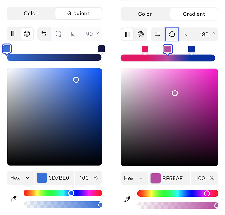
Add up to 5 color stops:
- Select the gradient bar to add a stop.
- Double-click a stop, or drag it off the bar, to remove it.
- Drag a stop along the bar to reposition it, or past another stop to reorder them.
- Set a unique color and opacity for each stop.
For a linear gradient, use the arrows to set its direction, or enter an angle directly in the text box.
Note:A radial gradient is always a centered circle—you can't move its centerpoint or make it elliptical.
Border
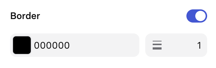
Toggle the border option in the inspector panel on to add and define the shape's border color and thickness.
Shadow
Toggle the shadow option in the inspector panel on to add and define the shape's shadow style, color, and the opacity of the shadow.
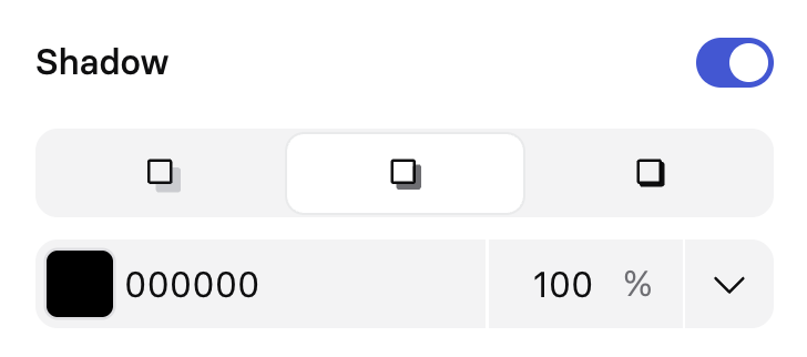
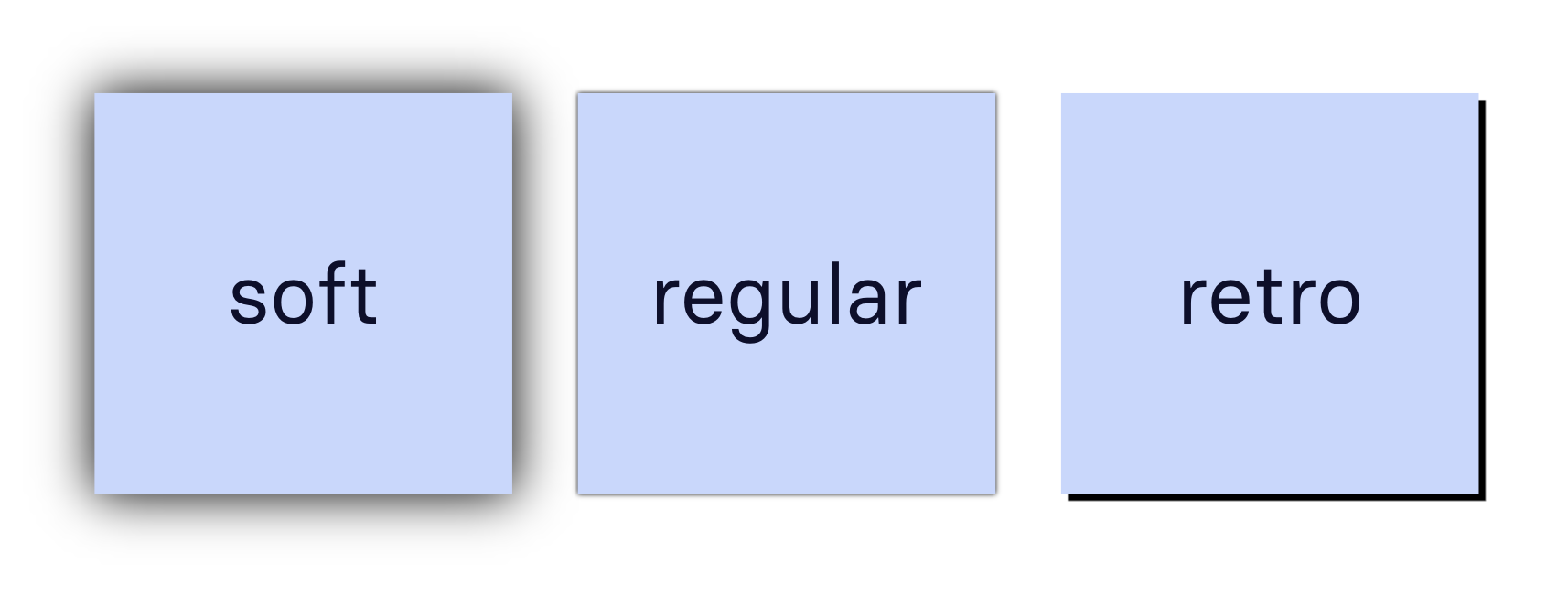
There are three shadow style options: soft, regular (default), and retro.
Updated about 2 months ago